AdWeek Review: Content. Branded.

As AdWeek nears its conclusion, we wanted to feature a panel that caught our interest. Titled “Content. Branded.,” executives from AOL, Machinima, The Weather Company, CBS Interactive, Senga, Univision, and Electus were all on hand to discuss their experience with different types of sponsored content across several different platforms and mediums.

Immediately there was unanimous consent that Red Bull is winning the branded content game. Red Bull Stratos, Red Bull Signature Series, their sponsorship of the America’s Cup, and their dedication to extreme sports were all billed as the present gold standard, and it introduced a concept that would shape the theme of the discussion: content that’s produced from start to finish, in house, that’s designed for core users or fans, is always going to succeed, even if it’s blatantly branded.

Another example: a State Farm sponsored segment on automobile safety on a car show. It was so informative and well-filmed that viewers gladly welcomed the State Farm logo in the corner. When the content is on point and well made, viewers are happy to respond positively.

A more subtle example is Biggest Loser. Billed as a reality show, the panel agreed that marketers should instead look at it from within: the Biggest Loser is a two hour, weight-loss experience. Thus, Biggest Loser-themed exercise Wii Games, Subway sponsorships, and other exercise themed branding fit into the show, and offer those watching important value. And even if NBC cancelled Biggest Loser tomorrow, the brand would still exist through the content. So if you can create content that will live beyond any natural demise, marketers will always be able to leverage the brand’s equity from beyond the grave.

The obvious question, though, was about the buzzword-of-the-moment, Native Advertising. How does it fit into this category? The distinction, according to the panel, is important: “Branded Content” is the never-been-done before content curated by the brand itself, while “Native Advertising” is the deep dive into things we do on a daily basis.

Think about it like this: If you’re going into someone’s home, you have to become familiar with those people, their home, and their lifestyle in order to be a good, welcomed visitor; this visitor is Native Advertising. On the other hand, Branded Content is the package that the family has been eagerly awaiting for weeks, and when the delivery arrives they burst running out of the front door to grab it out of the truck.

They’re two valid strategies for driving engagement, but you’ve got to do each of justice in their own rights. Ultimately, it comes down to establishing a relationship, both between the brand and the creative studio and the brand and the consumer. If you establish your niche, your “unfair advantages” in your market, and create compelling content that viewers are going to want, with or without the brand attached, you’re going to have a successful campaign.

Exclusive Movie Review: “The Little Mermaid Second Screen Live”

WARNING: This review contains spoilers for a movie that came out almost 25 years ago. It’s also a bit more exhaustive than these reviews tend to be, but we’re making an educated guess you won’t actually go see the movie (which is unfortunate).

Right up until showtime, my colleague Myles and I were not 100% sure we were even in the right place. It was 4:45pm on a Tuesday in a 25-screen Times Square multiplex, and we were the only ones in the entire theater. There was no “NCM First Look” pre-preview content, just a fairly audible buzzing sound. Then, to our relief, the lights dimmed and the show started.

Thus began our expedition to experience Disney’s augmented re-release of “The Little Mermaid”. What made this special, and why we were there, was that Disney is experimenting with an interactive big-screen format meant to bring more kids to the movies. They call it: “The Little Mermaid: Second Screen Live!” I’m not a fan of their naming this a “Second Screen” experience. “Second Screen” is industry-speak within advertising and entertainment, and people in those industries too often assume the general public knows what we’re talking about. The most egregious expression of this pet peeve of mine is in the liberal use of the word “content” in marketing communications. “Hey Jill, I saw the most awesome exclusive content last night” said no one, ever.

In any case, this Disney experiment is titled such that you’re meant to know you can experience the movie on a big screen and a screen in your hands simultaneously. While using your iPad during a movie is almost always strongly discouraged,  this experience is meant to be an exception. Not only are you encouraged to have an iPad, not having one seriously detracts from your ability to enjoy the movie.

When “The Little Mermaid” came out, I was too old for it, and my colleague Myles was not yet born. So we came at the experience from two different perspectives. He also had a built-in leg-up on me vis a vis the in-movie trivia, since I had never seen the movie before.

I had pre-loaded the “Little Mermaid SSL” app onto two Lab iPads and had them fully charged, ready to go. As we waited for the movie to start, we found the provided “SSLIVE1” Wi-Fi access point, but figured out pretty fast it had no uplink to the Internet. When the show starts, the actress who does the voice of Ariel comes on and walks you through the required iPad setup procedures. She tells you to turn Airplane Mode on (to conserve battery?) and then turn Wi-Fi back on, then connect to the access point “SSLIVE1”.
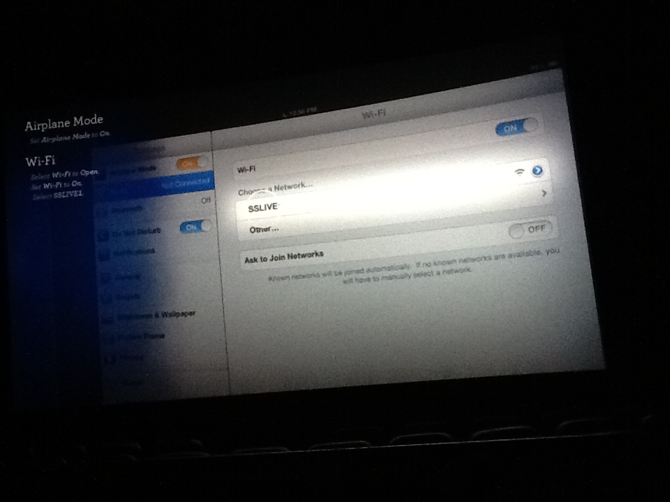
IMG_0013Up on the movie screen, they explain how to set up your iPad


I suspect the Wi-Fi part of this is not to transmit content, so much as it is to relay players’ scores back to a central computer running the show. More on that later.

It appeared as though the iPad app stayed in sync with the movie via audio watermarking. A few times I exited out of the app to check something else on the iPad, and when I went back in I saw it “Listening …” and then syncing right back up.

Throughout the movie, the relationship between what’s going on in the movie and all the activities on your iPad is guided by the characters Sebastian and Flounder. In fact, at the beginning, you are asked to join either “Team Sebastian” or “Team Flounder” (“Team Edward” was not an option). During moments of sustained lack of dialogue, an extra layer of voice-over has been added to the movie wherein Sebastian and Flounder banter about the iPad-based games you’ve been playing. When characters in the movie are talking, they switch to communicating with you via captions at the bottom of the movie screen, written as if Sebastian and Flounder are texting each other. I thought that was actually a pretty clever solution for maintaining continuity without drowning out the actual movie.

Periodically throughout the movie a caption of this type announces a new game is coming up, along with a 5-second countdown clock up on the movie screen. Then a game happens down on the iPad. Some games were very directly linked to the action in the movie (e.g. “What Happens Next?”) and others were just skill games (e.g. “Pop the bubbles as fast as you can”). One game, somewhere in between, had you tilting the iPad back and forth to right the sailors’ ship during the big storm towards the beginning of the movie.

Here are some screenshots of game examples:
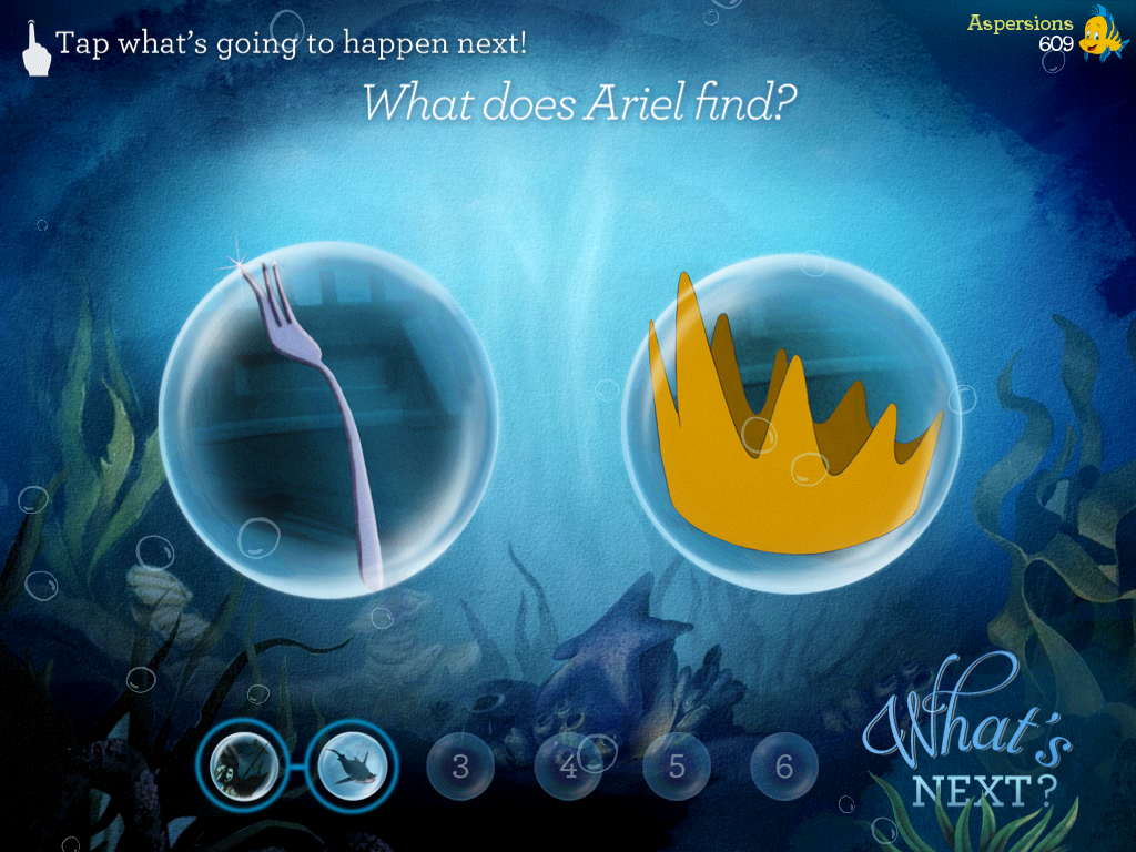
IMG_0019“What Happens Next” – rapid-fire game that follows the movie closely
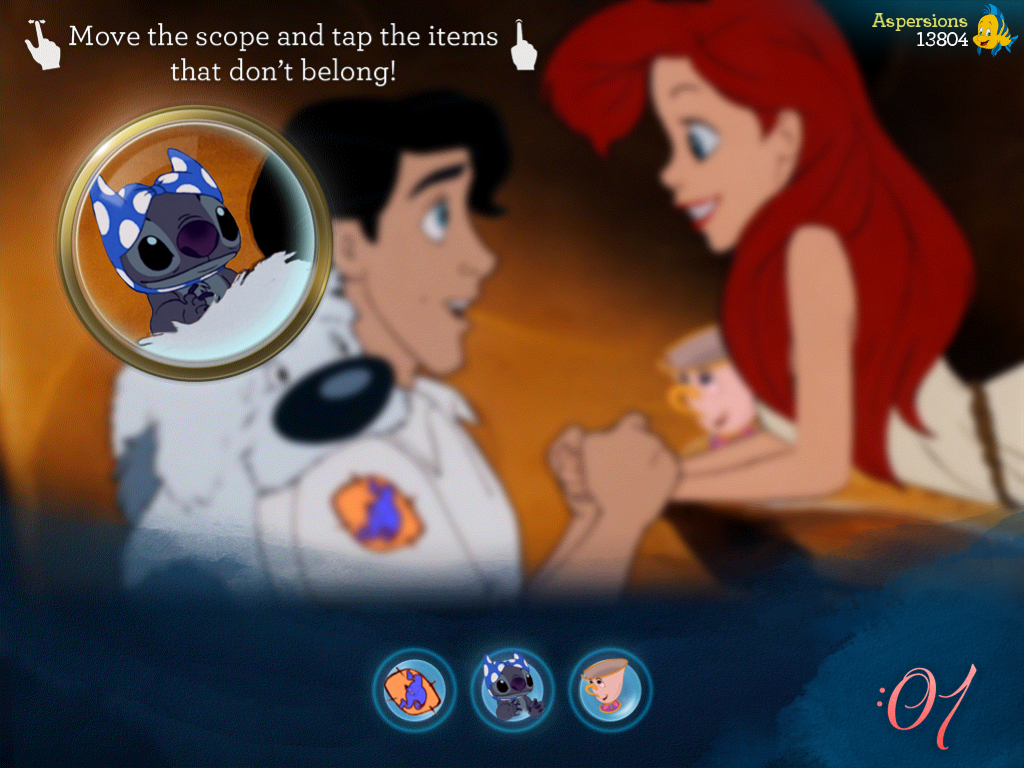
 

IMG_0031What doesn’t belong in this scene? In this example, you had to find three things.
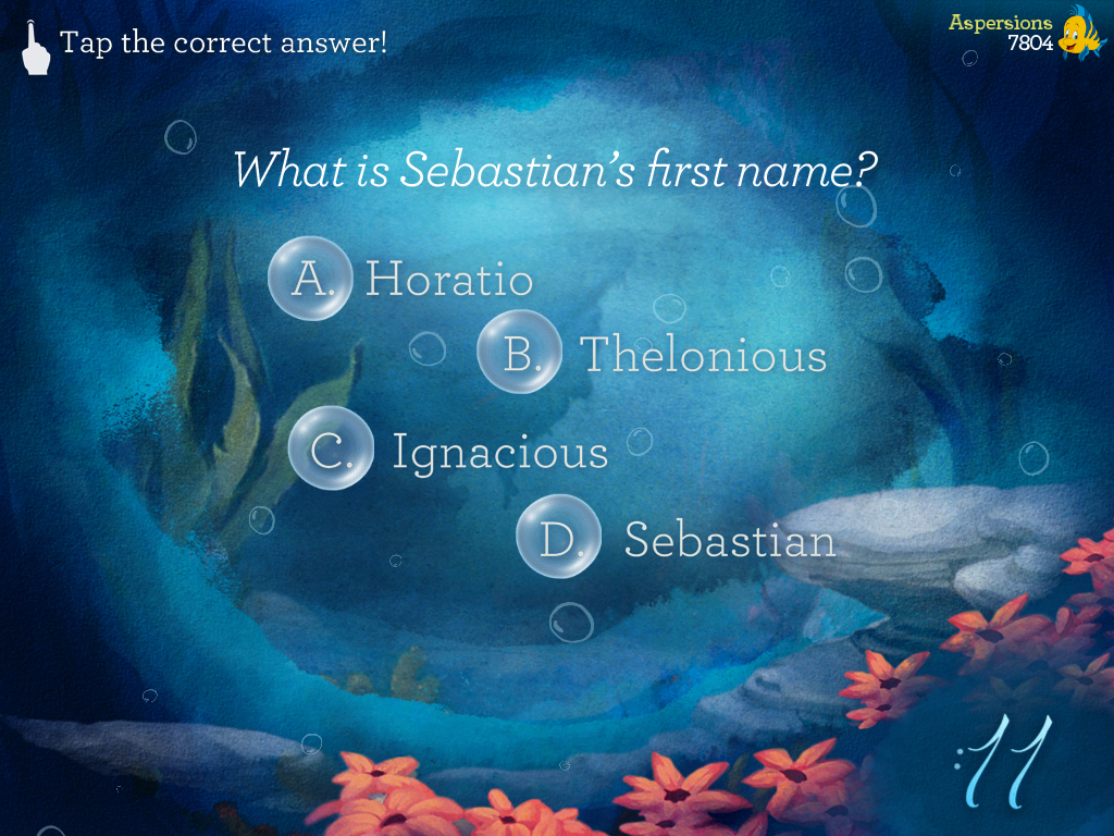
 

IMG_0023Straight-up multiple choice trivia


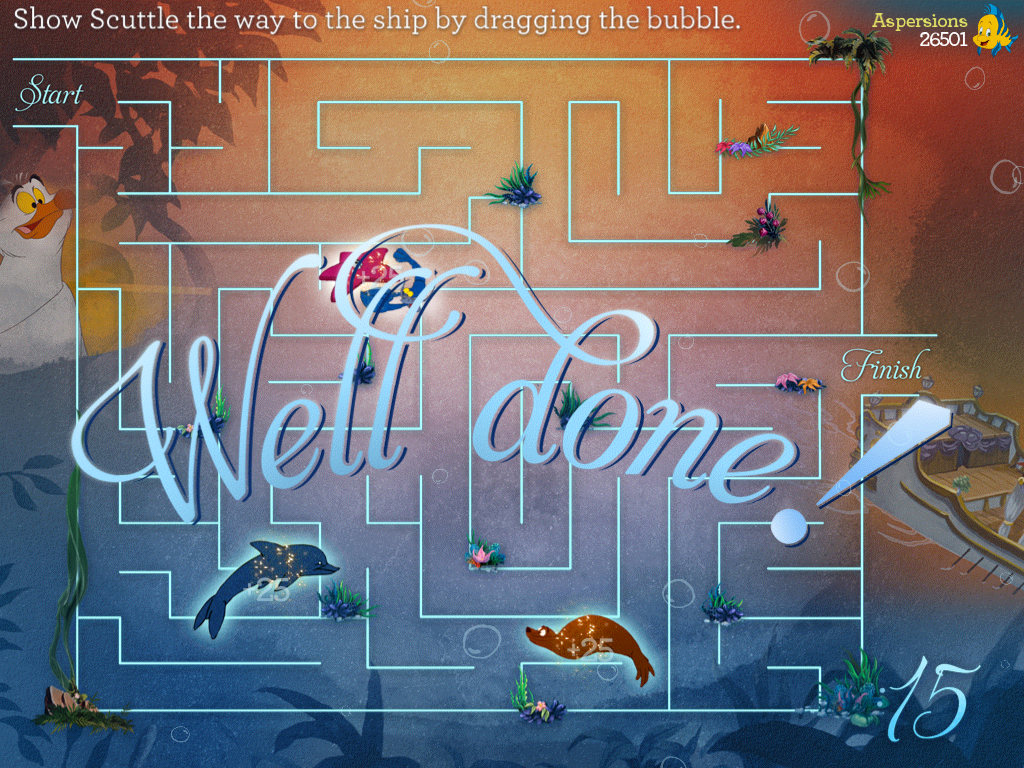
IMG_0035A maze!  The maze themes more or less followed what was going on in the movie


As you play these games, you earn points. Periodically, Flounder or Sebastian chimes in to show you the running scores of Team Sebastian vs. Team Flounder. Since Myles and I were the only ones playing along, this conveniently reflected our individual scores as well.

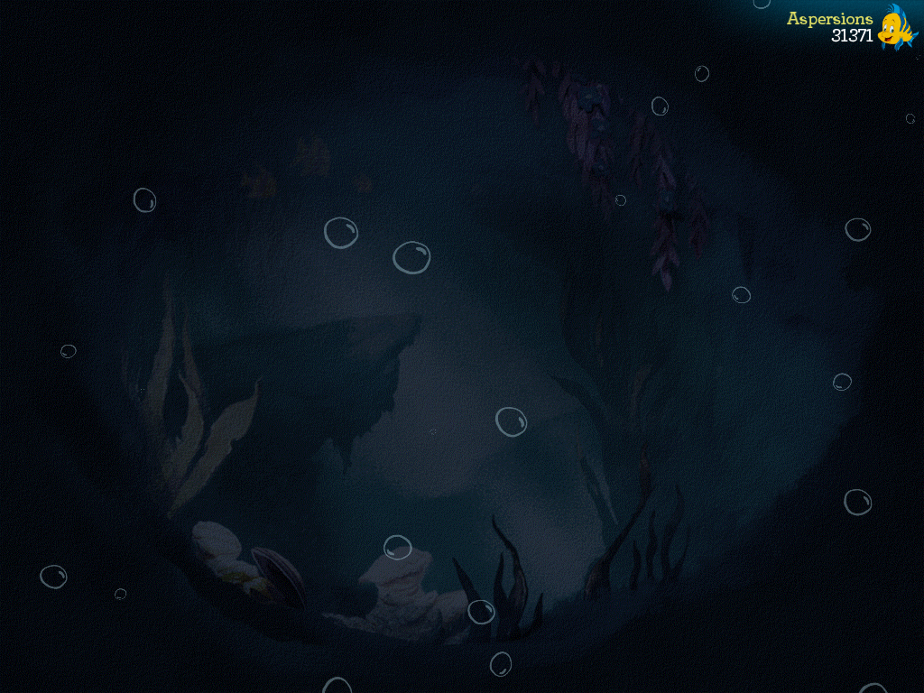
Towards the end of the movie, when Ursula makes her big devious move, The points of Team Flounder and Team Sebastian are united under the banner of “Team Ariel”, and a “Team Ursula” appears. It stands to reason that Team Ursula consists of just Ursula. At the climax of the movie, as the action on the big screen oscillates from hope, to dashed hope, and then eventual triumph of good over evil, Team Ursula’s score, reflected on the iPad artificially jumps ahead of Team Ariel then back down, then ahead again, and finally disappears. Team Ariel then breaks back down to its two components as the movie ends. We felt the way the point scoring changed and then changed back got a little confusing and wasn’t explained thoroughly enough. We figured it out but that’s because we have some sense of how they were trying to line up with the movie narrative and get the kids to root for Ariel. That said, I’m pleased to report that when all was said and done I overcame my trivia disadvantage to beat Myles 31,371 to 29,091. Go Team Flounder!

The games do get a bit repetitive after a while. Although there are at least half a dozen that I can remember, they come at you pretty relentlessly, and each one is played at least 3-4 times. The games also can distract you from key points in the movie.

I think my biggest overall gripe with the experience is when Ursula finally gets killed(?) I missed how it happened because I was busy playing a game on the iPad. Also of note, a couple times during the movie they actually freeze-frame it and let you complete a puzzle on the iPad. Great if you have an iPad, but probably a little irksome if you don’t.

There are also several fun less competitive touches to the experience. When the characters break out into the song, kids are encouraged to sing along (“Crab-E-Oke”) and the lyrics appear on the iPad in time with the song:
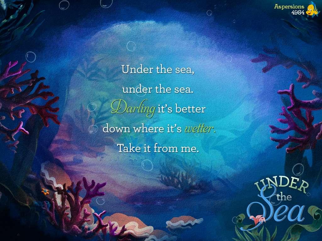
IMG_0022Under The Sea


Also, periodically throughout the movie, kids on either team are encouraged to cheer for their side. This is a great way to prep them for a future rooting for sports teams.

I felt as though overall this was a cute, fun, thought-provoking experience. It’s a shame no one else was in the theater with us, especially any kids. Myles pointed out that an 8-year-old with an iPad would really enjoy this sort of thing a whole lot. We both felt it was a very interesting use of the technology and a good way to breathe some life into a classic movie everyone’s seen before.

If you know a kid who is in the right age group for a Disney cartoon and likes the iPad, this is definitely 90 minutes well spent. Likewise, if you are a UX person working anywhere near the second-screen experience space, I’d highly recommend trying to run out and catch this movie before it is out of theaters. The experience just won’t be the same on home video. Act fast, based on the attendance we saw you may not have much of a chance left.
 

MAGNA Infographic: The World Of Advertising In 2012

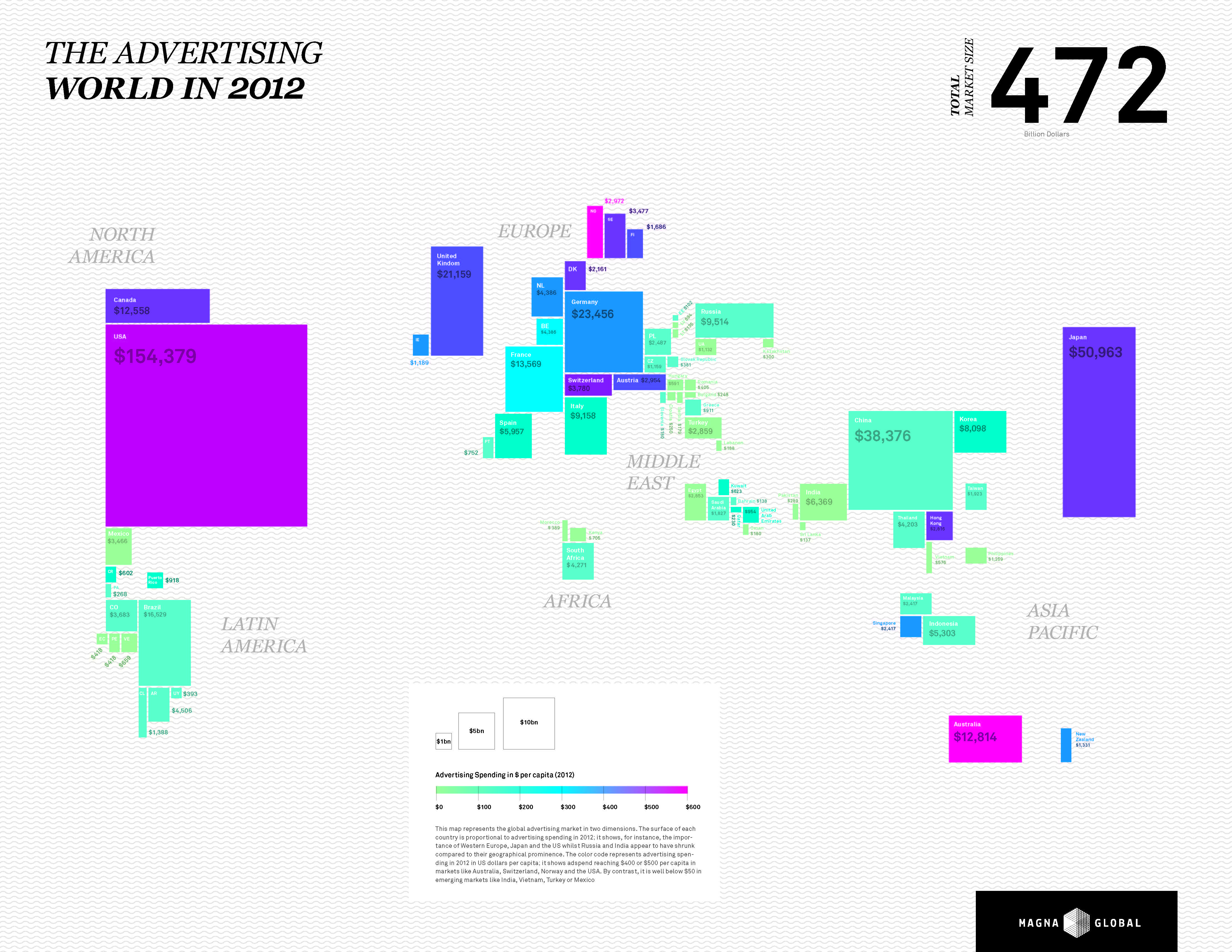
This map from MAGNA represents the global advertising market in two dimensions. The surface of each country is proportional to advertising spending in 2012; it shows, for instance, the importance of Western Europe, Japan and the US whilst Russia and India appear to have shrunk compared to their geographical prominence. The color code represents advertising spending in 2012 in US dollars per capita; it shows adspend reaching $400 or $500 per capita in markets like Australia, Switzerland, Norway and the USA. By contrast, it is well below $50 in emerging markets like India, Vietnam, Turkey or Mexico.

MAGNA INTEL POSTER

Thoughts On iBeacon, BLE & NFC

Much has been made this week about Apple’s “iBeacon” functionality baked into iOS 7. It wasn’t part of the 5C/5S keynote, it’s more of a wonky technical detail. But some have embraced it with exuberance as an “NFC-killer”.

But first, for the uninitiated, an iBeacon primer. iBeacon is an Apple flavor of Bluetooth Low-Energy (BLE). BLE is pretty much exactly what it sounds like – a new form of Bluetooth that doesn’t drain your battery nearly as fast. The trade-off, though is less data throughput. So no streaming media over it, or even your voice. It is designed to transmit very small packets of information. “What good is that?” you might ask. Well, if that small bit of information is “you are standing in the cereal aisle” or “here is a short URL that links to content relevant to this particular spot” then there could be many useful applications.

With BLE-enabled devices an apps, your device can be always listening for these sorts of cues, and not drop to 0% battery after 2 hours. If your phone is always listening, you are always reachable with contextually relevant ads, offers and other content. And that’s great, as long as what you are pinging people with is relevant enough for them to not mind (or enjoy!) getting it. I’m in the cereal aisle, I get a great offer that is relevant to cereal. I enter the European Masters exhibit at the Met, and my phone is pinged with a link to a synopsis of the exhibit.

BLE is also great for “Internet of Things” applications, such as objects with embeddable sensors. It’s all well and good to have a gadget that absorbs all sorts of great information about your body, or the world around it, but if transmitting that information out so it gets to the Internet drains the battery too fast, your smart object becomes a constantly-recharging pain. With BLE your SmartGadget can relay data to your mobile device (or a base station of some sort), which can in turn bounce that information up to the Internet as needed.

Some have argued this technology could be useful to mobile payments, but I’m not so sure about that. The infrastructure lift is a bit harder in that case, because the base station in the store needs to recognize the unique hardware ID of your phone, and tie that back to a specific basket of goods. Then it would have to recognize that a payment has been made. It’s a lot of moving parts.

With NFC, this equation is simpler because the device tapping the terminal is clearly the one paying for the items in the basket being tallied. While BLE is good at addressing ambient conditions, NFC is optimized for more deliberate and considered actions. In short, while BLE is optimized for a 10 foot radius around you, NFC is optimized for the thing you are touching right now. These don’t supplant each other, they are inherently complimentary.

If you ask five people for explanations of why Apple has not yet embraced NFC, you’ll likely get seven answers. Perhaps the most plausible one is that Apple doesn’t want to take the leap until there are enough tappable experiences out int he world. They don’t want to get everyone excited to go tap things, then go out into the world and find nothing to tap. Better to let Google take the hit on that user experience disappointment, their rationale might go. Or perhaps they really do think it is a passing fad. No one outside Infinite Loop can know for sure, but either way it is important not to read too much into it based on the soft launch of iBeacon technology.

Maker Faire returns to NYC this weekend

The “greatest show (and tell) on Earth” returns to NYC for a 4th consecutive year. The event spans two days and is hosted at the NY Hall of Science in Queens, NY. Five different zones cover the grounds located at the northwest corner of Flushing Meadows Park. Empowered by the maker movement each zone contains everything from performances to hands-on skill learning such as soldering a circuit or building a robot. Hackers, tinkerers and thinkers come together to share and learn. Sure you have your really deep-dive nerdy DIY electronic kit section but you also have drone flying, an entire 3D printing village and a giant life-size Rube Goldberg mouse trap. You might not think watching a giant mouse trap sequence would be fun but when you add a band (they had one last year) and all the DIY craftiness of old car parts, bathtubs, etc. it’s super fun. (Think OK Go’s “This Too Shall Pass” video).

More the lecture type? All the DIY craft a bit too much and you’d rather hear some people tell you about making things? There’s something for you too. The speaker lineup for Saturday and Sunday includes the founder and CEO of littlebits (absolutely fabulous snap together electronics learning kits for kids of all ages); the CTO of NASA (you’ve heard of them); founder of Arduino and Raspberry PI (DIY electronics kits that rock), Bre Pettis (do I need to tell you who he is? CEO of MakerBot), and many other tech and making evangelists.

“Part science fair, part county fair, and part something entirely new, Maker Faire is an all-ages gathering of tech enthusiasts, crafters, educators, tinkerers, hobbyists, engineers, science clubs, authors, artists, students, and commercial exhibitors. All of these “makers” come to Maker Faire to show what they have made and to share what they have learned.” says Maker Media

Maker Faire is brought to you by Maker Media.  Maker Media publishes MAKE magazine, produces Maker Faire, and offers DIY electronics, tools, kits, and books through its online and pop-up Maker Shed stores.

Disney is the presenting sponsor with a collection of other levels of sponsors including Microsoft, Ford and Chobani.

The website has all the details: http://makerfaire.com/
Program & Schedule: PDF download directly

Follow @nysci and @makerfaire

There is also an app for iOS and Android.

YuMe & IPG Lab Media Trial: Is the Tablet The Ultimate Video Viewing Device

IPG Lab teamed up with YuMe to measure tablet video viewing. In a media trial comparing the media consumption of 8,300 respondents across different devices (PC, Smartphone, Tablet), the study set out to examine the following:

  • Where and how tablet users view video
  • Which devices garner the greatest viewing attention
  • Which devices deliver the greatest ad effectiveness

The results proved that the tablet is an awareness machine – garnering the most attentive and undistracted audience that’s most likely to remember the brand ads seen. As traditional TV viewership continues to decline, tablets, in concert with other digital video platforms, are ready to assume the mantle as the next generation of TV.

See the infographic below for the full results:


YuMe_IPGMediaLabTablet_July 2013 copy 2


Leap Motion Available in HP Laptop

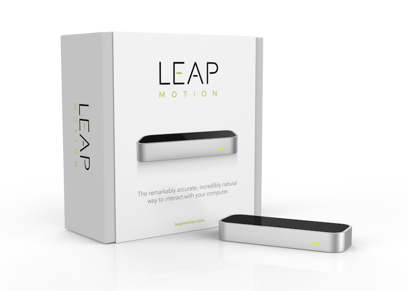
For the first time, consumers can purchase the Leap Motion completely baked into the hardware of a device. As a part of the HP Envy 17 Notebook PC, Leap Motion is already leveraging its relationship with the manufacturer. Available for purchase sometime “in the next few weeks,” Leap created a special micro-sensor to fit into the laptop that’s a mere 3.5 millimeters tall; it’s the smallest 3D motion controller on the market presently. It’s located below the keyboard and can be activated by pressing function and the space bar. The Envy will be available for $1049.99.

Respect Your Elders: Why Banner Ads Were The OG of Native Advertising

My grandma, Lola Charo, rocking it in animal print, aged 86
My grandma, Lola Charo, rocking it out in animal print, aged 86


Native advertising is a hot topic right now, and aside from certain shortcomings, (such as scale and the lack of third party measurement tools) they’ve proven to work harder than traditional online ads.

The Lab, in partnership with Sharethrough, ran the industry’s first native ad effectiveness study using both eye-tracking and survey-based techniques, which showed that native ads smashed banner ads in every respect – from the ability to attract attention, to purchase intent, to the likelihood to recommend a brand.

Interesting therefore that this article in the NY Times suggests that in the future, native ads – which blur the lines between content and advertising – may end up breaching the reader’s trust in the publication… and by extension, reader and brand.

Far more fascinating though is the idea that the banner ads – often held up as the antithesis of what good advertising should be — were once highly effective, with an average click-through rate of 44 percent.  Today the average rate is just 0.1% (if you’re lucky).

It’s amazing to think that in the very early stages of the web, banner ads actually served as little portals into a whole new world of web content that users at the time didn’t even know existed.  In the beginning, banner ads blended in and added value to the web content experience—and as such, can be seen as the first native ads on the web.

It was only with the advent of sophisticated search engines that these ads stopped being relevant to the web discovery experience, and users started to consider them annoying and intrusive.

The NY Times article cites Forbes as being at the vanguard of the (new) native advertising, with its long form BrandVoice ad product (read Lewis Dvorkin’s eloquent writing on the subject here)—and we couldn’t agree more.

But history shows that in the future it’s likely that native advertising, (which blends in and adds value) will change in favor of something more appropriate for the times.

We have every reason to believe in the native advertising du jour, but as the shape and user expectation of content evolves, we’ll be keeping our eyes peeled for the next breakthrough ad format.


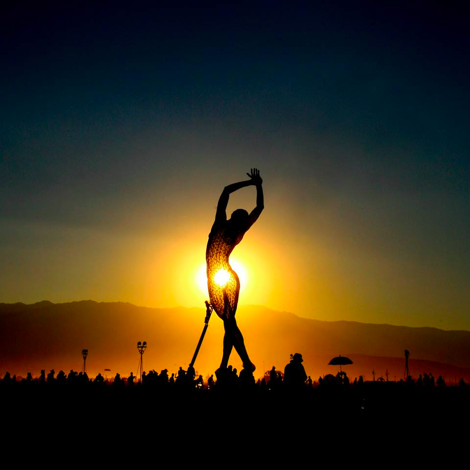
A Drone’s Eye View – The Only Way To Explain Burning Man To A Virgin

It’s around about this time of year that a lot of people ask what Burning Man is like: Who are the main acts? What do you do all day? What do you bring? Did you shower?

Um… the thing is, it’s extremely difficult to provide answers… which is in itself possibly the most infuriating response you can give. And this is because every person’s experience of Burning Man is so subjective, to the point that almost everything documented about Burning Man will always feel wrong or desperately lacking in the view of most other “Burners.”

With the advent of camera-armed mobile devices, there are certainly plenty of ways for individuals to record their specific experiences. But this also poses a conflict for Burners, who are constantly torn between the need to capture the moment vs. trying to be in it and simply enjoy it. The technical term for this (which results in something suitably painful-sounding) is digiphrenia– the “schizophrenic cacophony of divided attention and temporal disconnection.”

At the Lab, we talk often about how mobile is simply a bridging technology to a more convenient future where we will wear our tech, diminishing the need to capture the moment “in some crude or clumsy way,” as put in a post-Burn downer Techcrunch piece entitled: “The Mediated Life is not worth living.” 

But while wearing our tech might allow us to truly enjoy the present moment, and “help us stay human and stay more connected to our physical world,” the perspective remains purely subjective.

The only thing that could adequately communicate Burning Man to someone who has never been (aka a “virgin”) is some sort of omniscient being that can capture it in its totality.

And I am not referring to the alleged UFO sightings from last year – (I do like to preserve some of my British cynicism) – but rather other flying objects – UAVs or drones – which were observed flying over the Playa this year.

In my experience, the drone’s-eye-view provides an unparalleled 10,000 foot view on what Burning Man is, in its entirety and as true to scale as possible.

Now I am going to shut up, and let all you “virgins” take in this awesome video and judge for yourselves.

Image credit: Clay Greenbush

Branded Photobooth Apps

PhotoboothApps
In my virtual travels kicking the tires of various apps and technologies, I’ve come across a couple branded photobooth apps that have resonated with me and I thought were well-executed. They’re both simple, fun, and create earned media which in turn promotes a TV show.

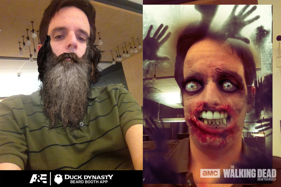
First there is KMco’s “Dead Yourself” app (iOS/Android) which allows you to take a photo of yourself and transform it into a zombie photo reminiscent of the Walkers from AMC’s “Walking Dead”. You can then share that image on social media or e-mail it to your friends.

There’s also the “Duck Dynasty Beard Booth” app (iOS/Android) which celebrates the A&E hit “Duck Dynasty”. In this app, you can superimpose one of the famous beards from the show onto your face and then snap a picture. The photo can then be e-mailed or shared.

And when these photos are e-mailed or shared, this forms a classic case of “earned” media, wherein audiences are using social media to spread your message without you having to pay them directly. I add that last qualifier because strictly speaking, a brand has to pay to get these apps built. But once they are built, there are few if any ongoing costs as the message goes out and spreads.

The above apps are special in a sense, because they represent a brand giving users a special dedicated & branded tool for self expression. This differs from, say, an Instagram photo contest, in that the platform is neutral and the actual image can only be so branded. A specialized tool can strike a much bigger tone with brand loyalists and create special media that those without the tool (i.e. less engaged audience members ) cannot create. As such, these sorts of apps become a powerful mechanism of brand advocacy that [when executed well] can trump a simple text-based social mention.

When a friend of a dedicated fan sees the cool picture that’s been created, they can become drawn in, wanting to create their own similar photo. And as they do, they become much more likely to care about watching “Walking Dead’ or “Duck Dynasty” if they didn’t care already. They in turn then become advocates, because what is the point of making one of these pictures without sharing it with your friends?

This sort of campaign tactic isn’t right for all brands. You need a brand that sparks the imagination of your audience and makes them feel like creating and sharing. That just doesn’t work for some product categories, but it does for many such as entertainment in particular. These apps also cost some money to build, so a plan needs to be in place with social media objectives to justify the initial cost outlay.

But if those prerequisites can be met, a branded UGC app could be just the right thing to anchor a brand’s short-term earned media strategy.