What Happened
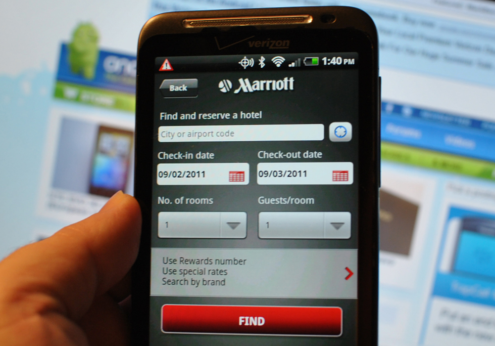
Looking to enhance its customer experience on mobile, Marriott Hotel has updated its app based on guest feedback to offer a more intuitive user experience. The revamped app sports a “one-button” ergonomic design that is easy to navigate, along with a swipeable home screen that let users easily switch from different scenarios such as checking-in or planning future stays. Each swipe will bring up a new page that brings up the most relevant information for their needs within those contexts, such as access to Marriott Rewards account information or personalized content delivered via the app’s built-in messaging service called mPlaces. The international hotel chain has achieved some early successes with its mobile app, which drives $1.7 billion in annual bookings.
What Brands Need To Do
Marriott is certainly not the first brand to adopt the swipeable designed popularized by dating app Tinder – cosmetic retailer Sephora also opted for a swipe-based interface for its mobile app, – but the way the hotel chain used this mechanism to let guests easily navigate the app through different stages of their travel and quickly get to what they need. As more brands rush into the mobile space, they should take note and learn to design it in a mobile-intuitive way that presents a user experience that matches with consumer behavior.
Source: Travel&Tour World